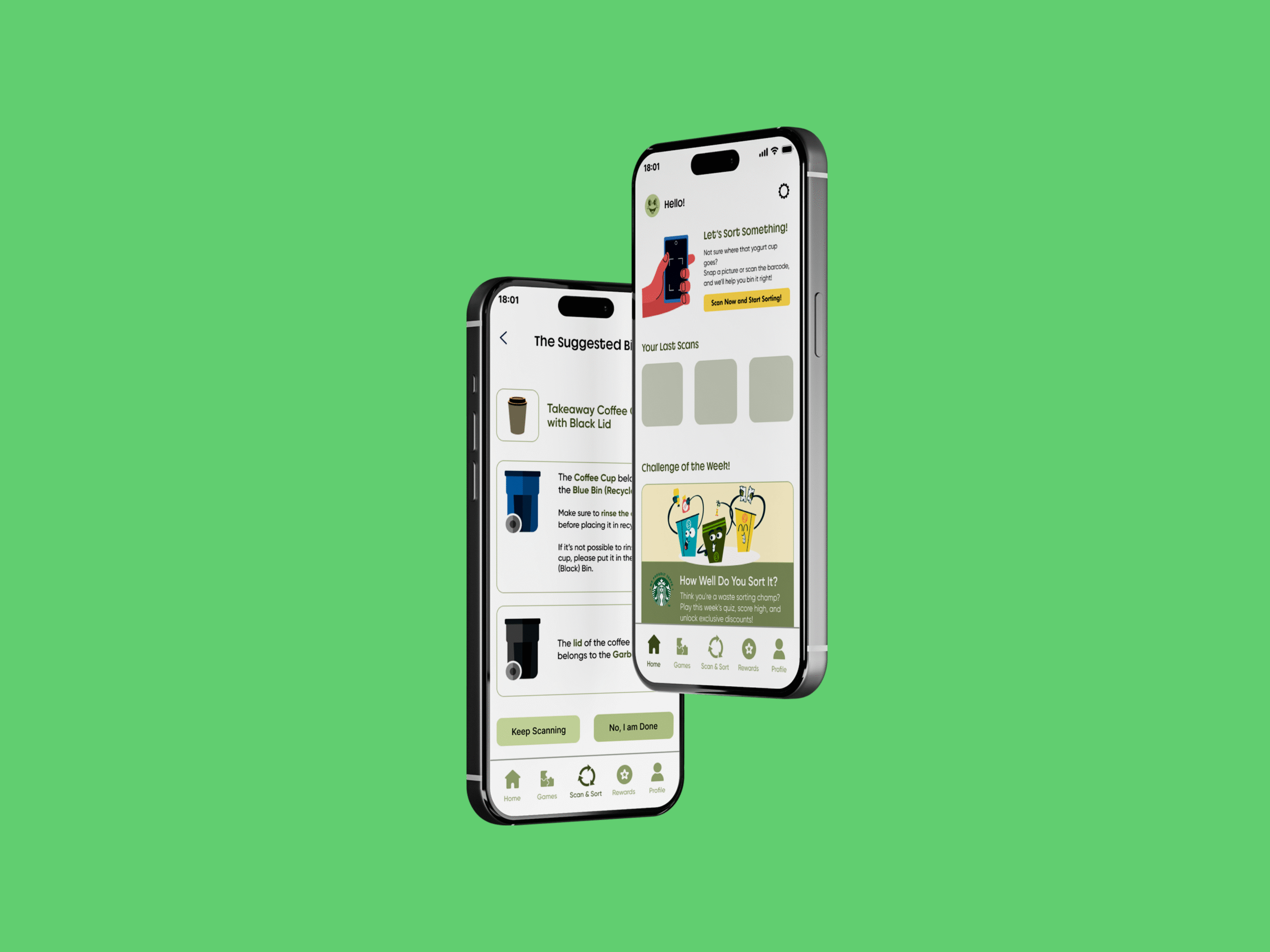
Sortit is an app that helps people figure out where their waste goes — without needing to decode complicated recycling rules.
Think of it like a self-checkout, but for your trash. You scan, it tells you where it goes. That simple.
This was my capstone project, and I led the entire thing — from research and wireframes to testing and iteration. I played the role of product designer, researcher, and manager all in one. While I drove the whole process solo, I did loop in my collaborator group when I needed extra help — like for observing user sessions or reviewing early sketches. So when I say “we” in this case study, it reflects those small but valuable collaborative moments along the way.
You’ve got a coffee cup, a lid, and a sleeve. Three bins. Zero clue. You want to do the right thing, but you’re late and guessing feels easier than sorting.
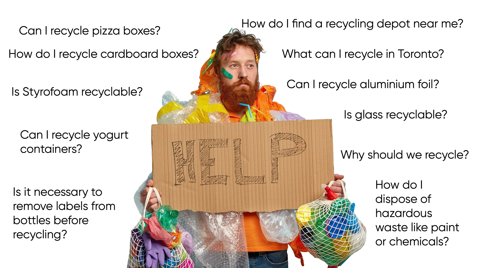
Most people want to sort their waste correctly, but:
Rules vary by city or region.
Government websites are confusing or outdated.
It’s easier to just guess.
This leads to wishcycling - throwing things in recycling hoping it's right - which does more harm than good.
On top of that, research shows that by 2040, landfills in Toronto will be full due to limited space and increasing garbage. This puts extra pressure on our environment, making waste sorting more important than ever.
We did some digging (pun intended) through waste management sites, Reddit threads, and local government portals. Most were… a mess. Confusing layouts, long PDFs, and no quick answers. Then we talked to people — friends, flatmates, strangers in group chats — and even conducted a few quick interviews. The patterns were loud and clear:
“I honestly just guess.”
“My city has rules but I can’t find them easily.”
“I’d use an app if it was quick and simple.” were… a mess.
We also scanned through municipal websites (hello, clutter) and looked at apps that already existed. Most felt either too basic or too overwhelming — nothing in the sweet spot.
That gave us two goals:
👉 Speed + simplicity for everyday use
👉 Engaging extras to keep users learning
Because if people enjoy using it, they’ll keep coming back — and that means less guessing, more sorting.
From everything I heard — the rules are confusing, websites are clunky, and people just want a straight answer without thinking too hard — one thing was clear: this needed to be quick, easy, and kind of fun to use. So, the goal became: how do I make this feel effortless? Here's how it all started.
Personas & User Journey Mapping
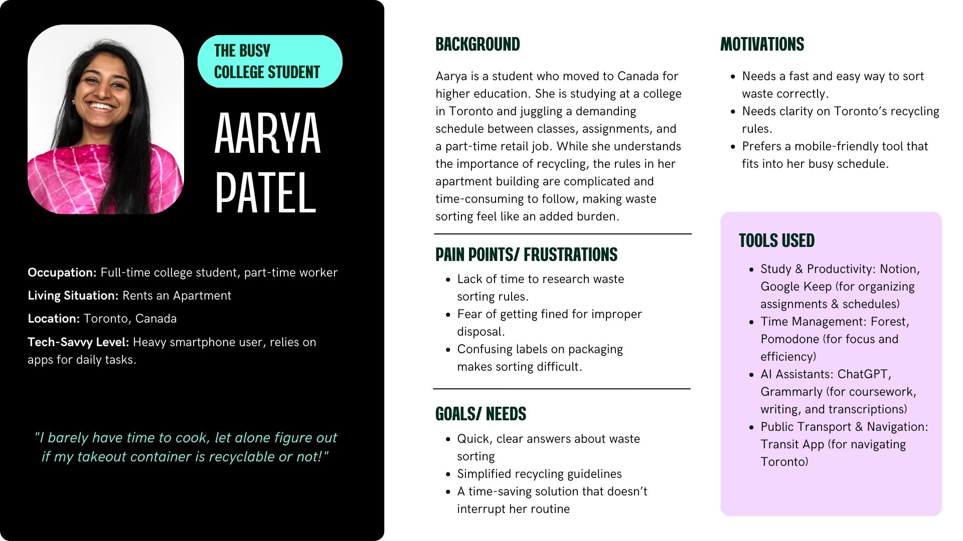
We started by building user personas based on all the research and interviews — people who felt guilty guessing, people who didn’t bother checking, and people who cared but couldn’t find answers fast enough.
Once we had them in front of us,
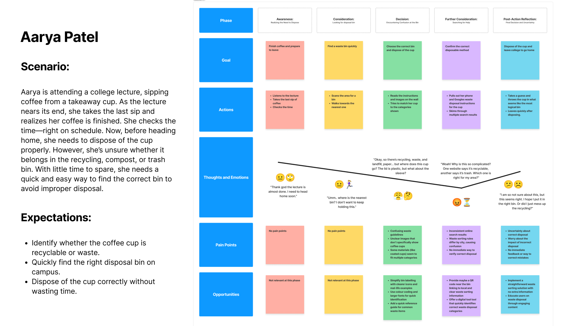
we mapped out what a typical “throw-it-away” moment looked like — from confusion to “eh, I’ll just toss it.”
The idea was to spot where we could step in and make things smoother.
Content & Architecture
Next up: figuring out the bones of the app. What content do we really need? How many screens are too many? We kept it tight — a smart scanner, a simple manual search, local rules, and a little space for challenges and rewards. The navigation had to be dead simple, and every section had to answer: “What do I do with this?”
Low-Fidelity Wireframes
Once the structure felt right, We sketched it out into low-fidelity wireframes. Nothing fancy yet — just enough to test the layout, flow, and see if the app felt intuitive.
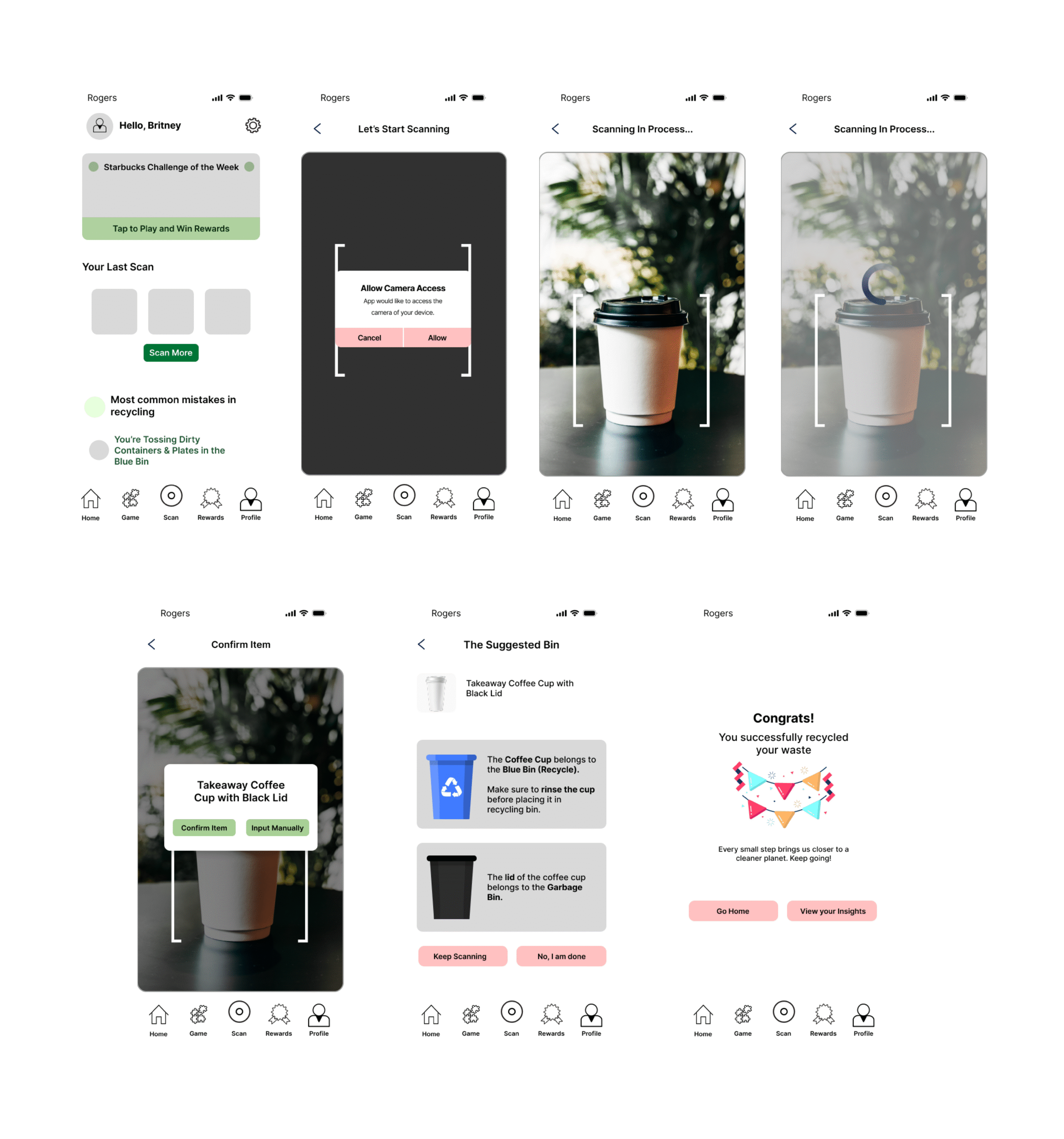
Usability Testing
We conducted usability testing on a low-fidelity prototype of the Sortit waste-sorting app with five participants, a mix of college students and working professionals. The idea was to understand how users interact with key features like scanning waste, checking disposal suggestions and exploring rewards. Sessions were done both in-person and over Zoom, where we observed user behaviour and collected feedback in real time.
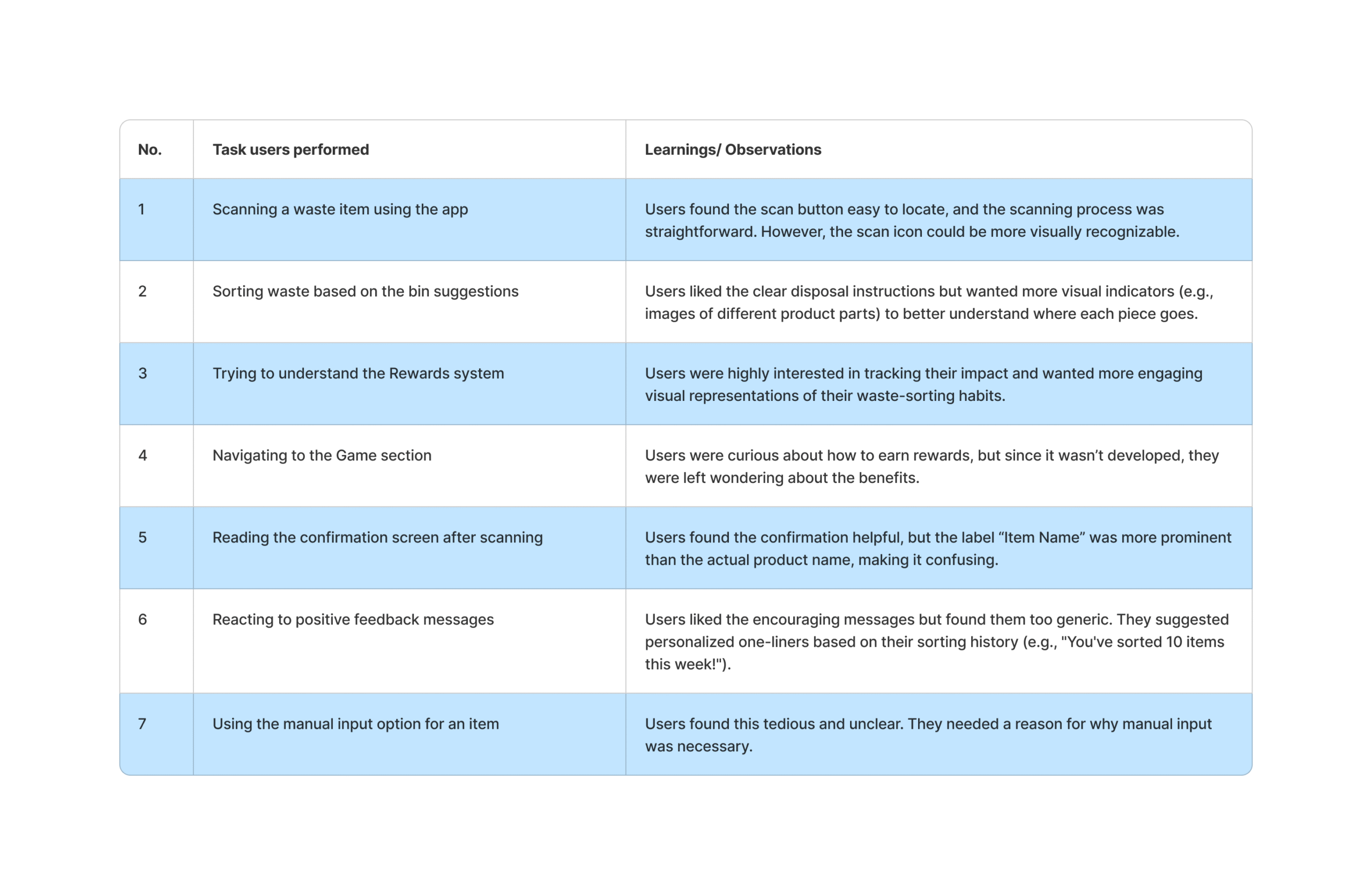
Our Key Takeaways
Building Sortit started with a simple frustration: “Where does this even go?” But what we learned along the way was that most people genuinely want to do the right thing — they just don’t have the time or clarity to figure it out. Sorting shouldn’t feel like solving a riddle.
This project taught us a lot — not just about design, but about systems, habits, and behaviour change. Good UX doesn’t just make things look good; it removes friction from daily life. That was our biggest goal here.
From digging into messy city websites to turning recycling rules into bite-sized learning moments, this process made us believe more than ever in the power of thoughtful design and small nudges.
Sortit isn’t just a scanner. It’s a mini behavior shift disguised as a game — one scan at a time.