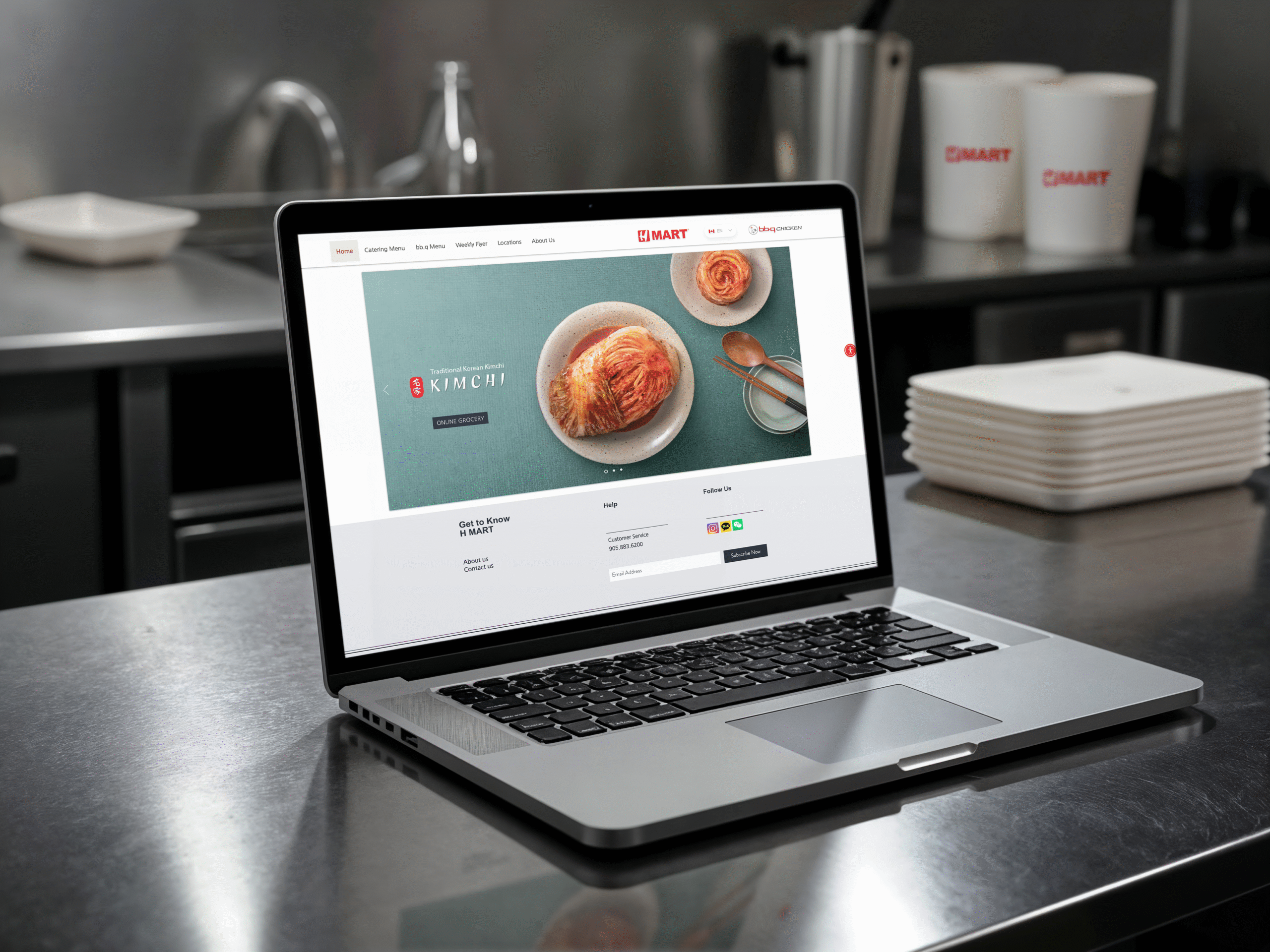
Our team conducted an in-depth evaluation of the H Mart Canada website to identify areas for improvement in usability, design, and content clarity. The goal was to enhance the overall customer experience by benchmarking against competitors and suggesting actionable design and content recommendations.
This was an insightful group project where each team member contributed to evaluating the digital storefront of a major ethnic grocery chain with an ever-growing audience in North America.
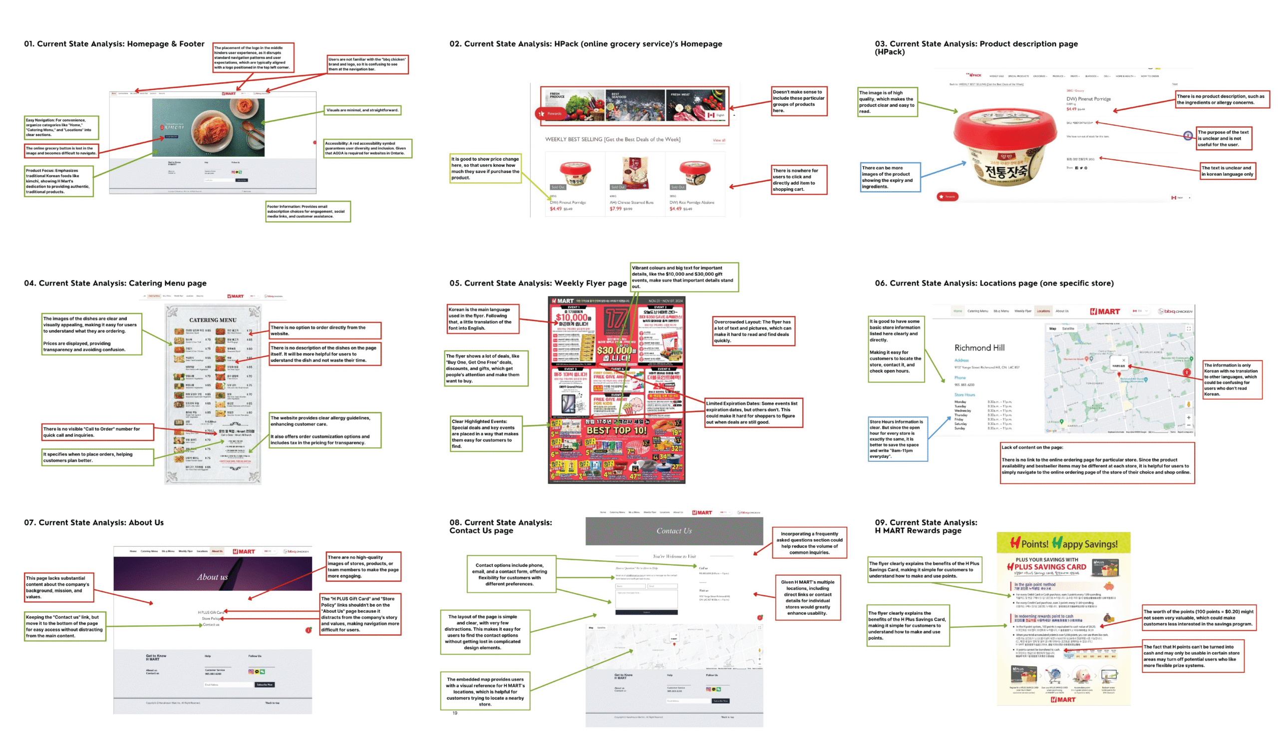
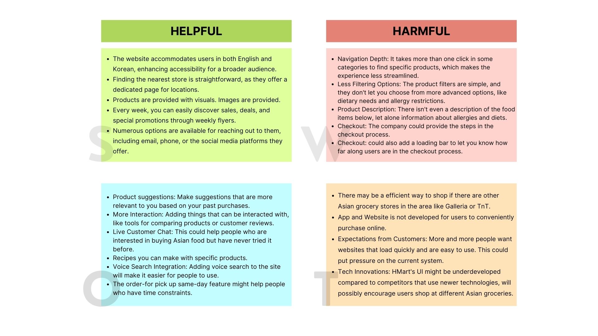
While H Mart is a well-known and trusted brand, its online presence didn’t fully reflect its scale or customer value. The interface often felt cluttered, navigation lacked consistency, and some features that are standard on competitors’ sites—like detailed product information or user-generated reviews—were missing.
Users looking for quick purchases or specific products could easily feel overwhelmed or unsure of where to go next.
We began our evaluation by taking a methodical approach, starting broad and narrowing in on specific user experience issues:
We studied key players in the grocery e-commerce space—T&T, Loblaws, and Whole Foods—to understand how they structure their websites, communicate their brand, and streamline the shopping experience.
These platforms showcased clear navigation, rich product content, customer reviews, loyalty features, and mobile responsiveness. We identified specific features from each that were worth emulating or adapting for H Mart, such as:
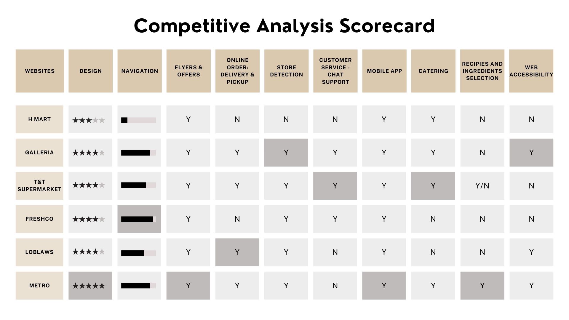
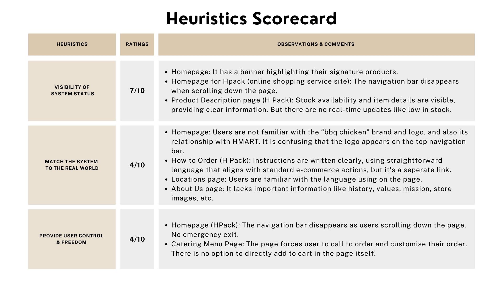
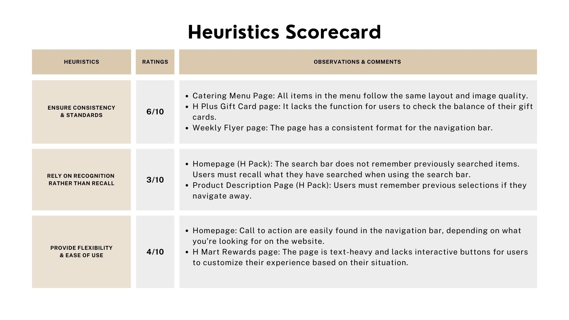
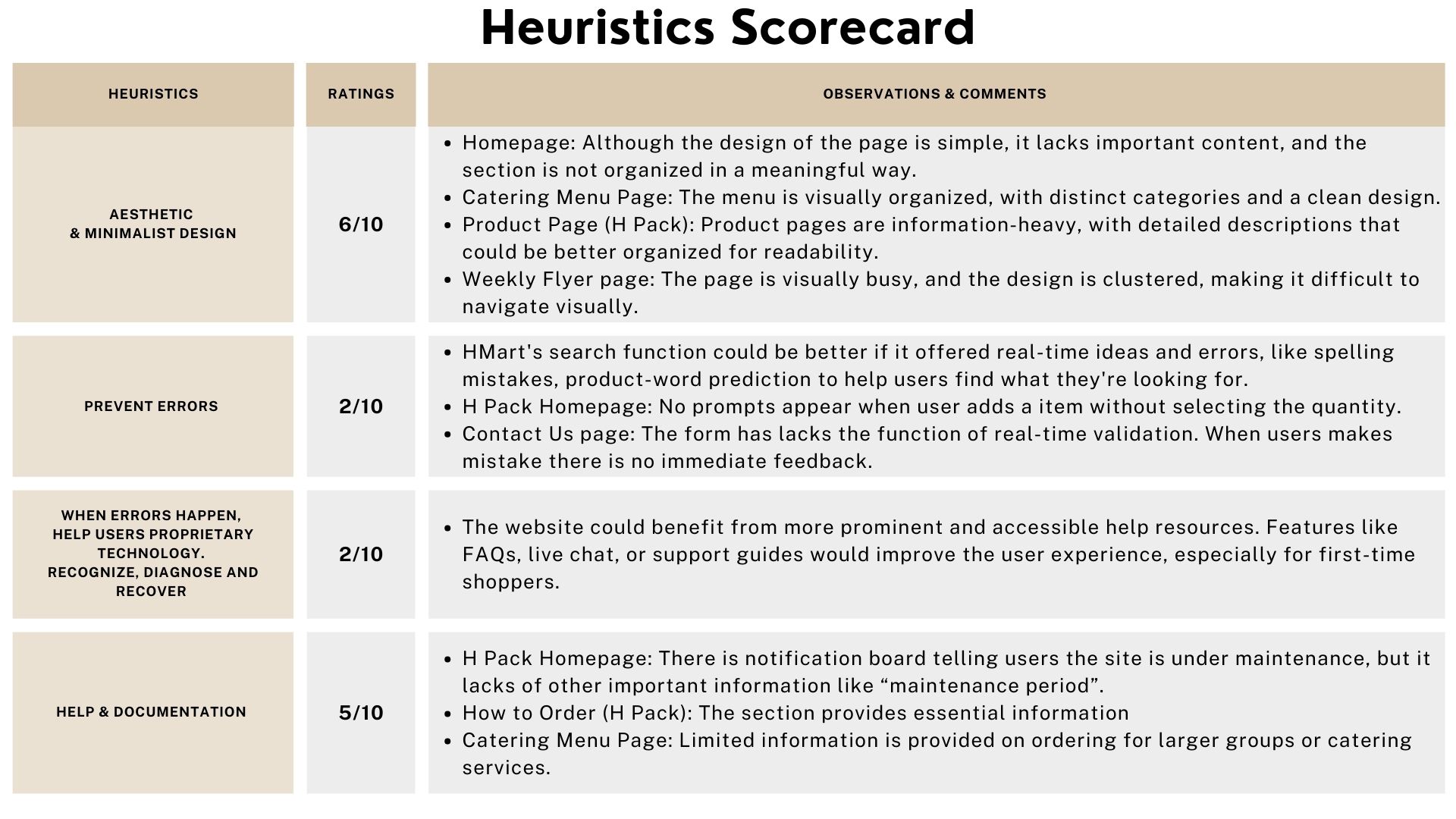
Current State Analysis
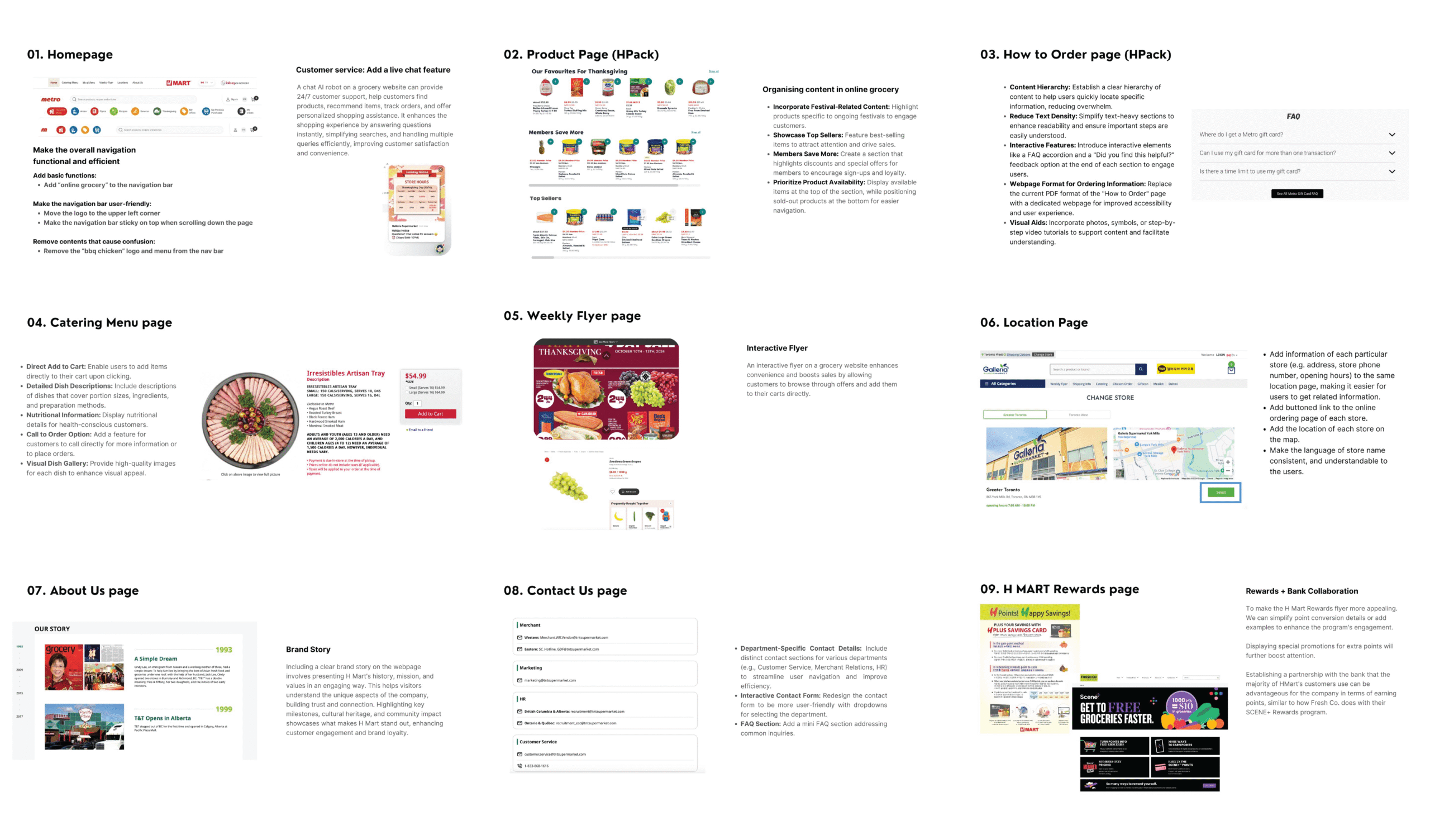
This project gave us a hands-on opportunity to look at an established brand from a UX/UI and content lens. It was about going beyond assumptions—using research and analysis to advocate for a better user journey.
The mix of design, content strategy, and usability testing made this one of our most well-rounded collaborative projects.